
Buildings you can read
Typography in Architecture

|
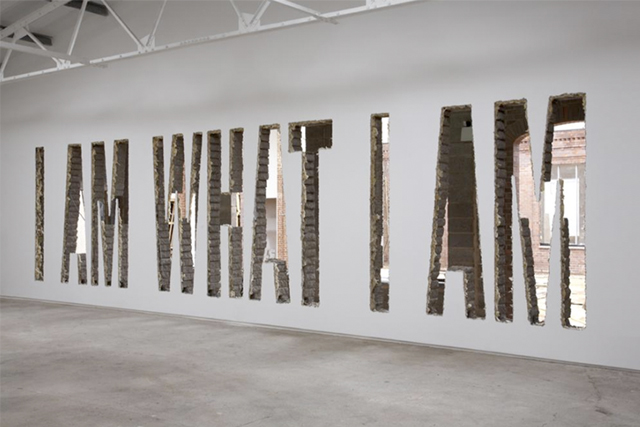
I Am What I Am Installation view, Ikon Eastside 2008 | Photo © Stuart Whipps via ikon-gallery.org
Typography in Architecture is already an old connection, visible in many historic buildings of our ancestors. Like architecture, typography also follow trends over time.
Nowadays, written representation in buildings is often inseparable from the building itself, as it is conceived during the architectural design process.
There are other cases where it is added later but not less integrated within the concept of the building, becoming part of it as a whole.
The message conveyed by characters on walls or facades of buildings has a huge impact: content is highlighted and the building also ends up standing out.
Next we present a selection of "buildings you can read" where one can clearly see the connection between typography and architecture.
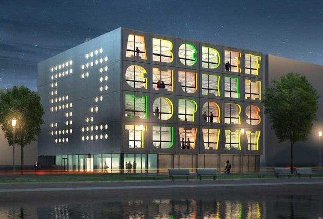
Alphabet Building (Amesterdam, Netherlands) | MVRDV
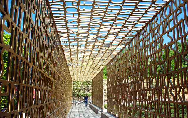
Christlicher Garten Marzahn (Berlin, Germany) | schlaich bergermann und partner
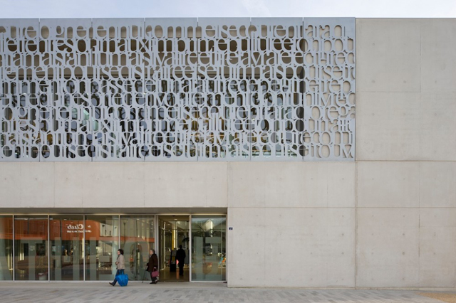
Fougères Bibliothèque (Fougères, France) | Tetrarc
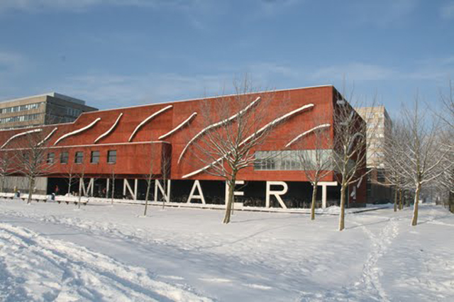
Minnaert Building (Utrecht, Netherlands) | Neutelings Riedijk Architecten
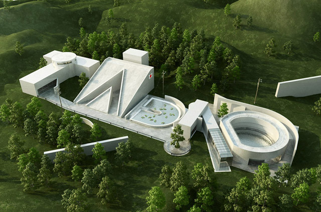
Tadao (3D illustration) | Christopher Labrooy
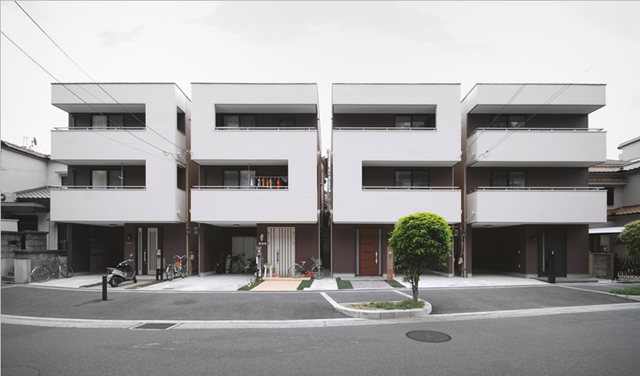
The Number House (Osaka, Japan) | Matsunami Mitsutomo
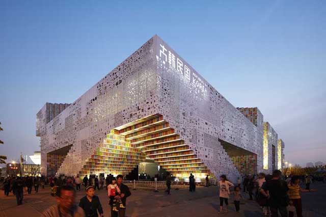
Korean Pavilion Shanghai Expo 2010 (Shanghai, China) | Mass Studies
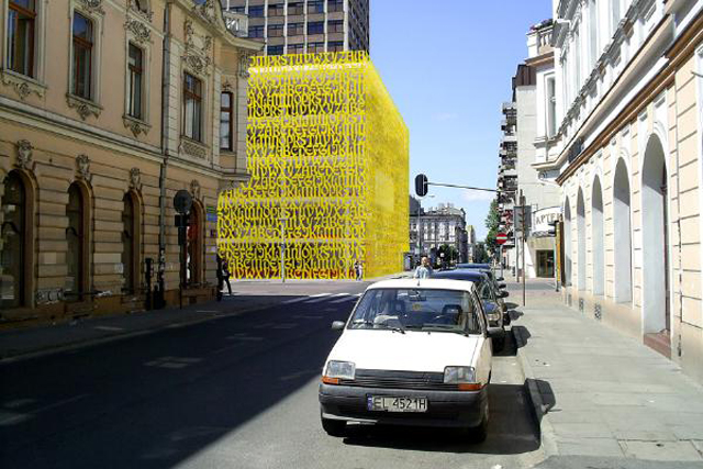
Public Library (Lodz, Poland) | Maciek Grelewicz
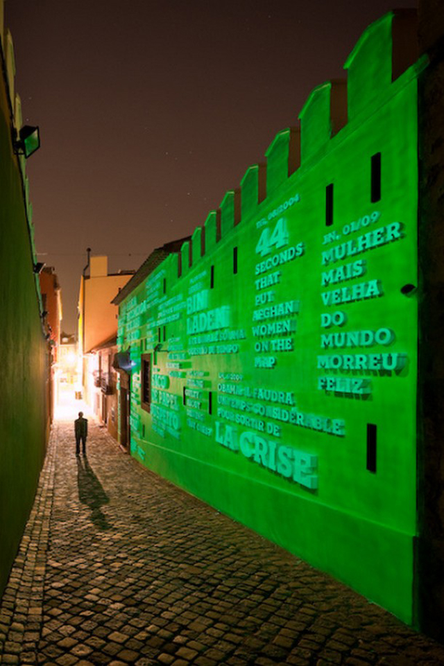
Ermida Nossa Senhora da Conceição (Lisbon, Portugal) | R2 Design
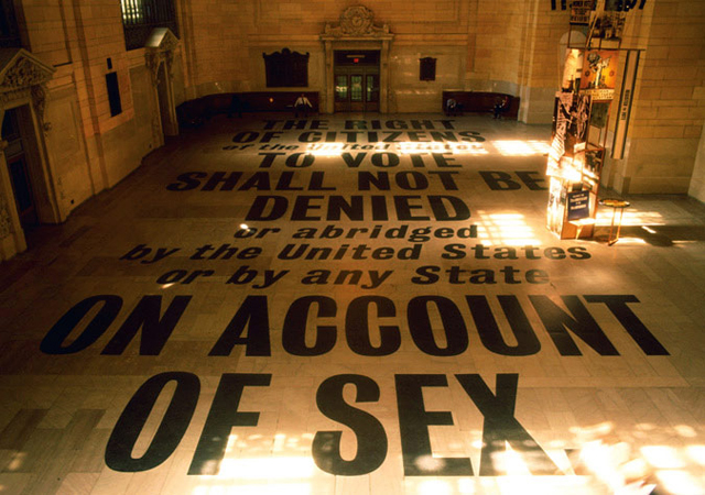
Grand Central Terminal (New York, U.S.A.) | Doyle Partners
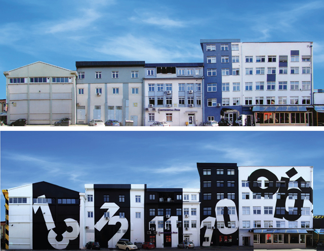
(Before and after) Zavrtnica business center (Zagreb, Croatia) | Brigada Agency
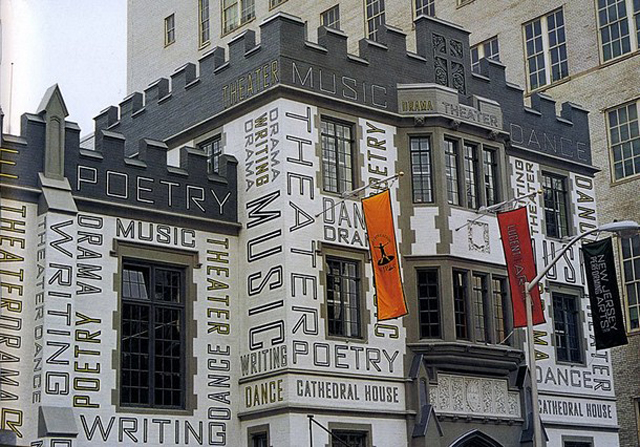
Performing Arts Center (New Jersey, U.S.A.) | Paula Scher


