
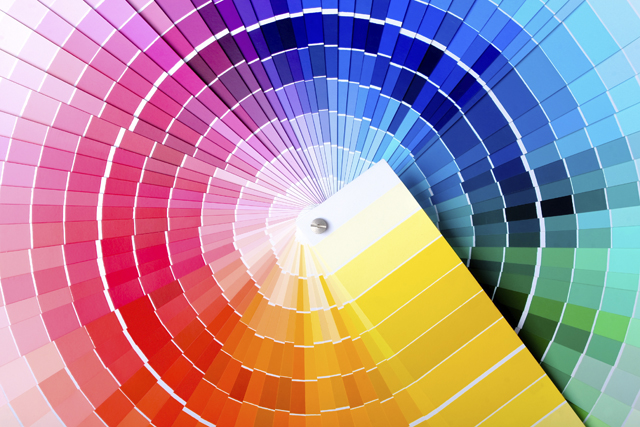
Choosing a Colour
Find out the ideal colours for every room

|
Colour can change the way we relate to certain room, increase or decrease the sense of space and light, or even alter our perception of its geometry.
The use of colour is essential to define the character and ambience of a certain room and may reflect many aspects of our personality, but can also convey sensations that influence not only our perception of space, but also the mood or the ability to concentrate for those who live there.
This is why it is important to consider a selection of colours appropriate to each space, something we often don’t give much importance but that can affect us daily.

The effects of the same colour may differ depending on the specific characteristics of the space in which it is applied, its dimensions luminosity, solar orientation, temperature or its intended use, and especially depending on who lives this space, varying with their age, gender or cultural heritage. However, certain colours or colour groups tend to cause similar effects in most people, while the major difference lies in the intensity or shade used.
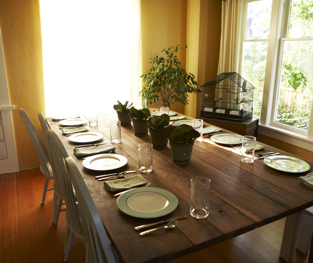
The choice of the most suitable colour for a certain room shouldn’t be conditioned only based on current trends or individual taste. It is essential to consider the specific characteristics of every room. For instance, choosing of warm colours, ranging from warm shades of yellow, orange or red, may help to avoid the feeling of a cold environment in a room facing north. Beyond that, it is necessary to consider the variations of colour and different shades. Bright colours are more vibrant and convey a lot of energy, stating a very strong and remarkable character in a room, while neutrals and pastels provide greater serenity and calm. Lighter shades reflect more light and tend to increase the feeling of space and brightness to a room, while darker ones can transmit a sense of sophistication and make a large space feel cosier.
Here are some basic notions and examples for the use of colour and its effect on different spaces:
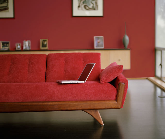
Red is a stimulating colour naturally, indicated to cause a strong impression in spaces, stimulating energy levels and communication, while some studies even indicate that this colour tends to raise blood pressure, respiratory rate and heartbeat.
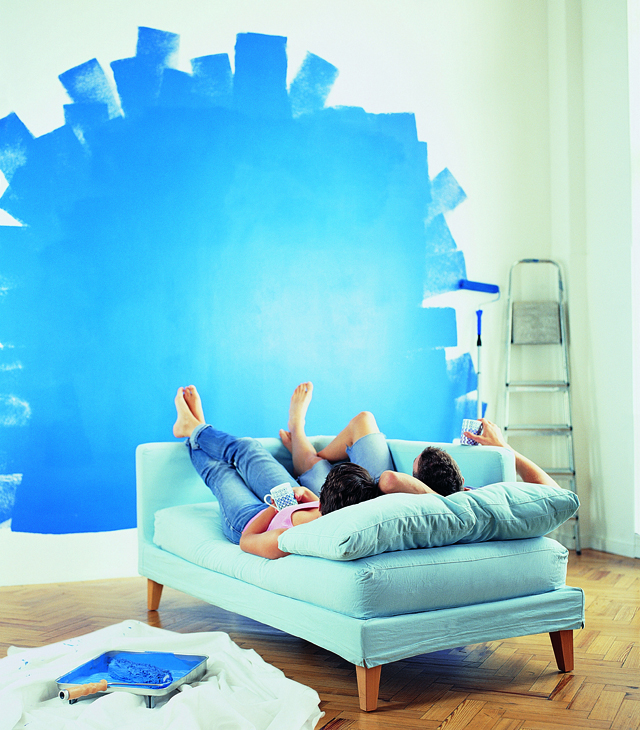
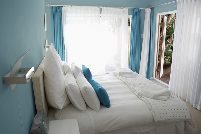
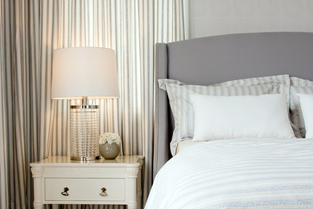
In opposition, the blue is considered calming, relaxing and serene, indicated for reducing blood pressure, respiratory rate and heartbeat, and for this reason quite suitable for bedrooms and other places to relax. Interestingly, some studies also indicate that blue has an inhibitory effect on appetite, so it may be unwise its abundant use in restaurants. However, some blue tones may become too cold and uncomfortable, especially when applied in rooms oriented north or low on natural light. In this case, it is recommended to use more vibrant shades of blue, combined with furnishings and fittings in warm tones to balance the environment.
Yellow refers to the sun, reflects luminosity and transmits energy. However, although it is a cheerful colour, most people tend to feel uncomfortable in spaces where this colour prevails, especially when used on very large surfaces or too bright shades, and therefore it’s not advisable to be a dominant shade in a colour scheme.
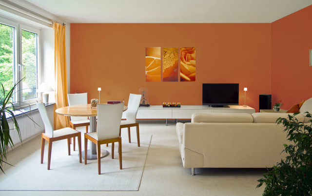
Just as red and yellow, orange evokes emotion and enthusiasm and may cause a stimulating effect and increase energy levels in a room.
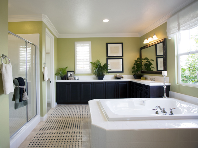
Associated with nature, green is the most comfortable colour for the eyes, balancing the energy of yellow with the tranquillity of blue, suitable to all kinds of spaces. Similarly to what happens with blue, some shades of green may become too cold and uncomfortable, especially when applied in rooms facing north or low on natural light, so it is advised to choose some warm tones to balance the environment.
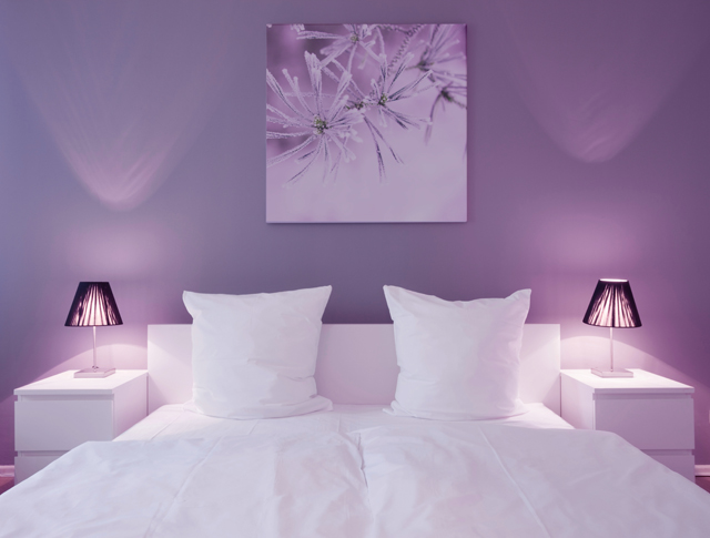
Purple, when used in darker shades such as aubergine for example, is a colour associated with luxury and creativity, which can confer quite rich, dramatic and sophisticated effects to any room. Lighter shades such as lavender, lilac and even some shades of pink, have the same relaxing effect and calm as some shades of blue, but without the risk of providing the sense of cold spaces.
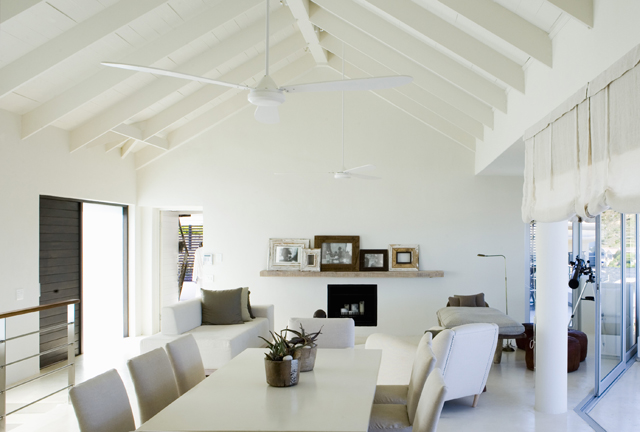
Neutral colours such as white, black, grey, beige and brown, are fundamental to any decor. Ambiances entirely neutral come in and out of fashion, but their virtue lies in its flexibility: you can add colour to cheer up a room or subtract colour to achieve a more sober look. It is advisable to use black in small doses, as tiny notes. In fact, some experts claim that any room requires a touch of black to accent a colour scheme, providing it greater richness and depth.
More important than choosing the ideal colour, the secret of a pleasant space lies in an harmonious combination of colours, shades, shapes and textures. If this process seems complicated you, start by defining two key questions:
What ambiance you want to create?
Which colours can transmit sensations of such ambiance?
To help clarify these questions, try getting inspiration from magazines, books, blogs and architecture and decoration websites, or you can take any existing element in the room as a starting point, either a piece of furniture, a carpet, a lamp or any other objects. Remember to limit your chromatic selection to 3 or 4 colours for a more harmonious effect.


